Loops are used when one wants to repeat a set of commands several times (iterations). For example,when you want to apply a set of operations on elements of a list, by choosing one element at a time, you can use a python loop.
There are two types of loops:
For loop
While loop
For loop:
For loop is used when we want to run the set of commands for a known or defined number of times. Few of the ways in which we can use the “for loop” is as follows:
Python
for i inrange(10):print(i)range(start, stop, step)
Here the range(10) function will create number in sequence starting from 0 and ending at 9. The value of i will thus stat from 0 and increase by 1 in each iteration stopping at 9
The general format of range function is:
Python
range(start, stop, step)
By default the value of step is 1.
The other way of running for loop is:
Python
mylist = ["a", "b", "c"]for i in mylist:print(i)mylist = ["a", "b", "c"]for i, element inenumerate(mylist):print(f'index: {i}, element: {element}')
abc
Here, the for loop iterates over each element in the list (mylist). In the first loop the value of “i” is “a”; in the second loop the “i” has the value of “b”; and so on.
The enumerate function allows us to simultaneously iterate over the elements of a list as well as yielding the indices of the current element in the list in a particular iteration.
Python
mylist = ["a", "b", "c"]for i, element inenumerate(mylist):print(f'index: {i}, element: {element}')
index:0, element: aindex:1, element: bindex:2, element: c
This is useful when you might need to access the elements of other lists relative to this index in the loop.
Lists in python are collection of objects. They can include any python objects such as numerals, strings, other lists and dictionaries. The list is defined by square bracket as follows:
Python
my_list = []
The above example shows an empty list. Following is an example of a list with numbers:
List index starts with zero as all indexes in python. Following is the general format of indexing a list.
my_list[from_index:to_index:step]
The to_index is not inclusive. It means that the list item at to_index will not be included in the result of indexing. We will see this an example of a list of number from 0 to 20.
Here, we indexed the list from 2nd index to the 18th index with a step size of 3. The default stepsize is 1.
We will see different ways of indexing/slicing a list not.
From a defined index (e.g. 5) to end of the list.
Python
a[5::]
[5,6,7,8,9,10,11,12,13,14,15,16,17,18,19]
From start of the list to a defined index (e.g. 15) including the item at that index.
Python
a[:15+1]
[0,1,2,3,4,5,6,7,8,9,10,11,12,13,14,15]
Python
a[:16]
[0,1,2,3,4,5,6,7,8,9,10,11,12,13,14,15]
The last element of a list can be indexed as -1, and the second last element is indexed as -2 and so on. Following are few example to index a list using negative numbers.
np.concatenate is used for concatenating numpy arrays. We will discuss here some of the functionalities of this method of numpy arrays. It takes a list of two or more arrays as input argument, and some other keyword arguments, one of which we will cover here.
Simplest usage of the concatenate method is as follows:
Python
import numpy as np# make two arraysa = np.array([1,2,3])b = np.array([4,5,6])# concatenatec = np.concatenate([a,b], axis=0)# print all the arrays and their shapesprint('\n\n', a)print('\n\n', b)print('\n\n', c)print('\nshape of a = ', c.shape)print('\nshape of b = ', c.shape)print('\nshape of c = ', c.shape)
a:[123]b:[456]c:[123456]shape of a =(6,)shape of b =(6,)shape of c =(6,)
Both of the inputs in above code are one dimensional. Hence, they have just one axis. np.concatenate has keyword argument, axis, whose default value is 0. In the above code, we have written it explicitly for clarity.
Let’s generate similar array of 2 dimensions. For this we need to provide the list of numbers inside a list to the np.array method.
Python
a = np.array([[1,2,3]])b = np.array([[4,5,6]])print('\n\nshape of a = ', a.shape)
shape of a =(1,3)
We can now see that the shape of the arrays a, and b is (1,3), meaning they have 1 row and 3 columns.
The rows correspond to the 0 (zeroth) axis and the columns correspond to the 1 (first) axis.
Let’s now say we want to stack the two arrays on top of each other. The resultant array should give us two rows and three columns.
We use the concatenate method as follows:
Python
c = np.concatenate([a,b], axis=0)print('\n\na:\n', a)print('\n\nb:\n', b)print('\n\nc:\n', c)print('\n\nshape of c = ', c.shape)
a:[[123]]b:[[456]]c:[[123][456]]shape of c =(2,3)
To stack the two arrays side ways to get an array of shape, (1,6), make the value of keyword argument, axis equal to ‘1’.
Python
c = np.concatenate([a,b], axis=1)print('\n\na:\n', a)print('\n\nb:\n', b)print('\n\nc:\n', c)print('\n\nshape of c = ', c.shape)
a:[[123]]b:[[456]]c:[[123456]]shape of c =(1,6)
When axis=0, the number of columns in each of the arrays need to be same. Also, when axis=1, the number of rows in each of the arrays need to be same.
You may concatenate as many arrays in one statements, provided their shapes are compatible for concatenation.
Python
c = np.concatenate([a,b,a,a,b,a,b], axis=0)print('\n\na:\n', a)print('\n\nb:\n', b)print('\n\nc:\n', c)print('\n\nshape of c = ', c.shape)
a:[[123]]b:[[456]]c:[[123][456][123][123][456][123][456]]shape of c =(7,3)
Class labels can be converted to OneHot encoded array using keras.utils.to_categorical. The resultant array has number of rows equal to the number of samples, and number of columns equal to the number of classes.
Let’s take an example of an arrray containing labels. First we need to import numpy to create the labels array and then define the labels array.
import numpy as nplabels = np.array([0,0,1,2,1,3,2,1])
The labels contain four categories.
np.unique(labels)
array([0,1,2,3])
To convert the labels to OneHot encoded array, excute the following:
import tensorflow as tflabels_encoded = tf.keras.utils.to_categorical(labels)print(labels_encoded)
Let’s say we want to convert multiple categorical variables into binary variables by selecting one category as “0” and the rest as “1”.
Or we want to change the values of an array based on a condition, such as in RELU function where all negative values are converted to zero and rest stay the same.
We can do this using np.where function.
Let’s take an array of letter from “A” to “E”. We want to have the letter “C” to be labelled as “0” and rest of the letter to be labelled as one. Following is ho we do it:
Now, let’s say we have a three dimensional array of numbers of size (20, 4, 4) and we want to emulate the RELU function where all negative number of the array would be set to 0 and rest remain the same.
We will generate an array of random numbers from standard normal distribution for our example and apply the np.where function to do the transformation.
a = np.random.normal(size=(20, 4, 4))b = np.where(a <0, 0, a)# print part of the arrays for understandingprint(a[0])print(b[0])
It is clear that the negative numbers in the array have been converted to 0.
We have only used a equal to (==) condition in above examples, but we may use any comparative operators as per our need. For example we can take log2 value of those numbers in an array which are greater than or equal to a certain number.
a = np.random.normal(size=(20, 4, 4)) *10a = a *10b = np.where(a >=5, np.log2(a), a)
Data distribution plots help visualize how quantitative data points are spread over the range of their values. Distribution of quantitative data can be shown in various ways such as box-plots, violin-plots, histograms, and scatter-plot with artificially introduced deviations to depicts density of the data points. However, I think the relatively simple looking histogram is the best way we can visualize the data distribution, because it visualizes exactly how many data points are present in a given range of numbers.
Boxplots are perhaps the worst because they only depict certain benchmark intervals like minimum, maximum, 25th percentile, median, and 75th percentile. We can’t really know what is the distribution of data points withing these percentile ranges.
Violin-plot fairs a bit better in giving us an idea of how many data points are there near a value. However, the smoothening of the width of the violin curve in the plots gives us a false impression of presence of data where there isn’t any. In the figure we can see the same data-points plotted in various forms. The violin plot’s smoothening effect causes the violin to never depict the absence of data in a range.
The scatter plot with random deviations, clearly shows that in certain range there is no data-point, but it fails to show us how many data points are there in a range of values.
The histogram solves all these problems. By adjusting the number of bins to show, we can exactly see how many data-points are there in a range of values and thus visualize the exact data distribution.
Often times you would want to save python objects for later use. For example, a dataset you constructed which could be used for several projects, or a transformer object with specific parameters you want to apply for different data, or even a machine learning learning model you trained.
This is how to do it. First, we will create a dummy data using numpy.
import numpy as npa = np.random.chisquare(45, size=(10000, 50))
Let’s say you want to transform it using the quantile transformer and save the transformed data for later use. Following is how you would transform it.
from sklearn.preprocessing import QuantileTransformerqt = QuantileTransformer(n_quantiles=1000, random_state=10)a_qt = qt.fit_transform(a)
Save python objects
To save a_qt using joblib the dump method is used.
import joblibjoblib.dump(a_qt, 'out/a_qt.pckl')
You can even save the transformer object qt.
joblib.dump(qt, 'out/qt.pckl')
Load python objects
To load the objects we use the joblib method load.
You can verify that the saved objects and loaded objects are same, by printing the arrays or printing the class of the objects.
print('Shape of a_qt: ', a_qt.shape)print('Shape of b_qt: ', b_qt.shape)print('Class of qt', type(qt))print('Class of qt2', type(qt2))
Shape of a_qt:(10000,50)Shape of b_qt:(10000,50)Class of qt <class'sklearn.preprocessing._data.QuantileTransformer'>Class of qt2 <class'sklearn.preprocessing._data.QuantileTransformer'>
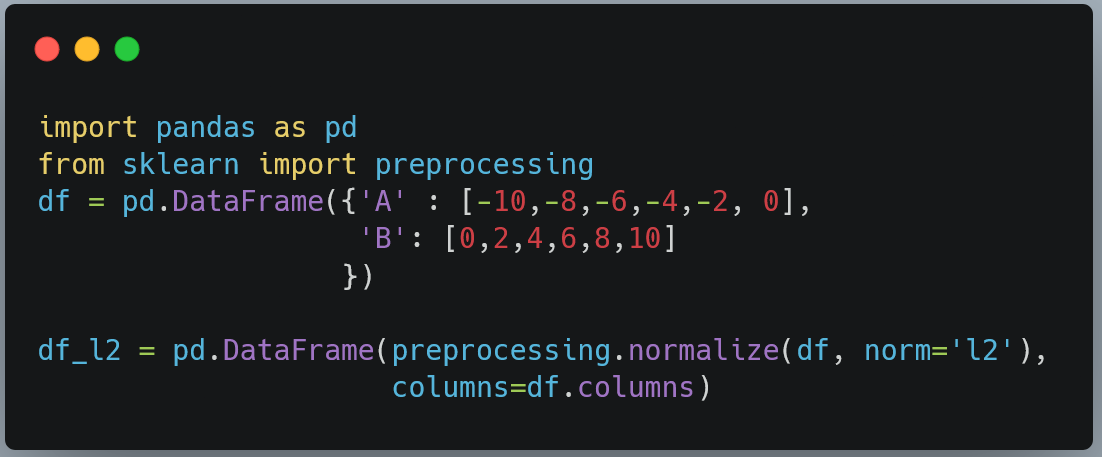
We can see above that for each row, the sum of absolute values is equal to 1.
The normalization function returns a NumPy array. However, generally we would want it to be a pandas dataframe with same column names as the original dataframe. This is how we do it.
The normalize function has default `axis` value equal to 1. If the axis=0, then the transformation would act of columns (features) instead of rows (samples)
The data as seen above, has four columns. First column, “Product”, represents the product, each of the other columns represents measured concentration of the metabolite in grams per litre. Each metabolite will occur three times in the ‘Product’ column as there are three replicates.
Rearrange data
We will rearrange our data so as not to have separate columns for each strain. We will rearrange it such that we have three columns, Product, Strain and Amount.
This is called as pivoting which is done by pivot_longer function. The resulting data will have nine instances of each metabolite in the ‘Product’ column.
data %>%pivot_longer(!Product,names_to='Strain',values_to='Amount')
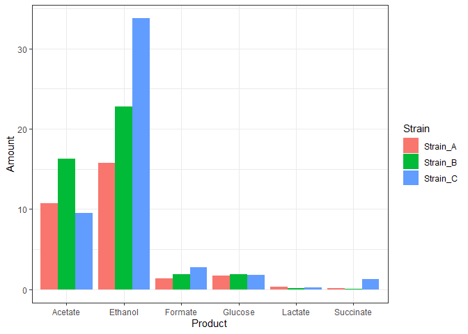
The rearranged data can now be easily plotted as a bar graph. Here is how we combine the rearrangement and plotting statements in one piped code.
data %>%pivot_longer(!Product,names_to='Strain',values_to='Amount') %>%ggplot(mapping = aes(x=Product,y = Amount,fill=Strain)) +geom_bar(stat="identity",position = 'dodge')+theme_bw()
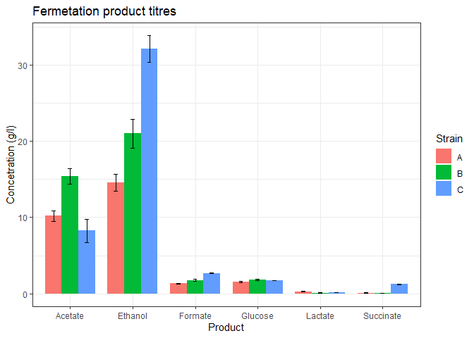
The above plot may look all right, but it doesn’t represent our data. The three replicates are plotted above one another.
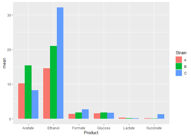
In the data such as ours, we will plot the mean of the three replicates and the standard deviations in the measurements as the error bars. So, first nee to calculate the means and standard deviations in our data.
Let’s start again by reading the data.
data <- readxl::read_excel('data/fermentation_products.xlsx')data
In the above table, we see that we now have only one instance of each metabolite and each value represents the mean value of the metabolite in a particular strain.
We also assigned the column names so that it contain only the name of the trains.
This data is now suitable to do pivot_longer as seen before.
## # A tibble: 18 × 3## Product Strain stdev## <chr> <chr> <dbl>## 1 Acetate A 0.690 ## 2 Acetate B 1.01 ## 3 Acetate C 1.53 ## 4 Ethanol A 1.11 ## 5 Ethanol B 1.92 ## 6 Ethanol C 1.73 ## 7 Formate A 0.0451## 8 Formate B 0.111 ## 9 Formate C 0.0666## 10 Glucose A 0.103 ## 11 Glucose B 0.0666## 12 Glucose C 0.0306## 13 Lactate A 0.0306## 14 Lactate B 0.0153## 15 Lactate C 0.0208## 16 Succinate A 0.0153## 17 Succinate B 0.0153## 18 Succinate C 0.0513
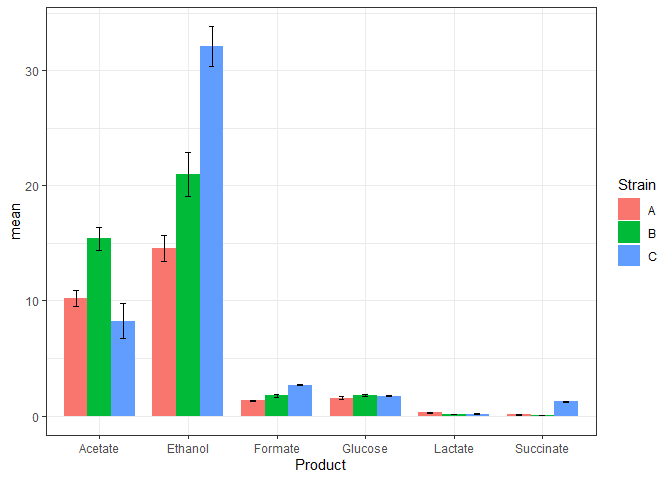
Now, we will add the standard deviation values into the data table that contains the mean values.
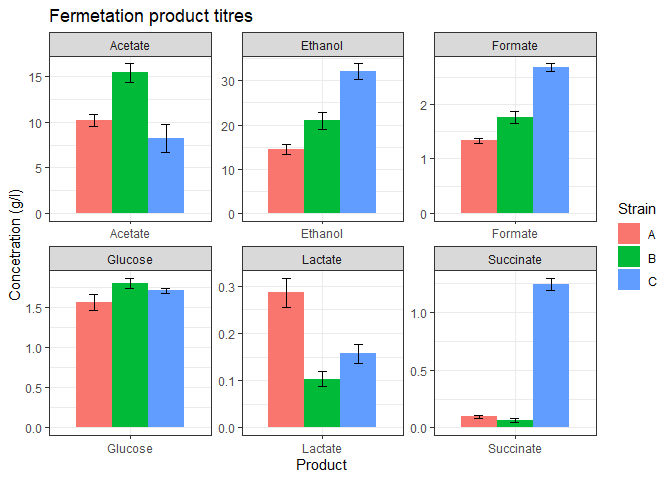
The above plot looks good but some of the products are too low in concentration. We could barely view their bars. facet_wrap function can be used to separate the plot into subplots so that each product gets its own subplot.
When we are going to use above code for our work, it would be very inconvenient run all lines of code each time we want to make the graph. Instead, we will write function such that we can run all the above code in one line and get the plot.
We will divide the code into two function, one for data wrangling and another for data visualization. A third function would call these two function so that we can just call the third function and draw the graph.
The three functions are written below.
# data wranglingtransform_data <- function(data){# calculate means and pivot longern_data_long <- data %>%group_by(Product) %>%summarize(A = mean(Strain_A),B = mean(Strain_B),C = mean(Strain_C), ) %>%pivot_longer(!Product,names_to = 'Strain',values_to = 'mean')# calculate st dev and pivot longersds <- data %>%group_by(Product) %>%summarize(A = sd(Strain_A),B = sd(Strain_B),C = sd(Strain_C)) %>%pivot_longer(!Product,names_to = 'Strain',values_to = 'stdev')# add st dev column to the n_datan_data_long <- n_data_long %>%mutate(stdev = sds_long$stdev)return(n_data_long) }# data plottingferm_plot <- function(data){#plotdata %>%ggplot(mapping = aes(x=Product, y=mean, fill=Strain)) +geom_bar(stat='identity',position = 'dodge',width = 0.8) +geom_errorbar(mapping = aes(x = Product,ymin = mean - stdev,ymax = mean + stdev),width = 0.2,position = position_dodge(width=0.8)) +theme_bw() +labs(title = 'Fermetation product titres',y = 'Concetration (g/l)') +facet_wrap(vars(Product), nrow=2, scales='free') }# call above two functionsplot_data <- function(data){n_data_long <- transform_data(data)ferm_plot(n_data_long)}
Now when we have these three functions, we can plot the graph in two lines.
Read the data.
Call the plot_data function.
# utilize the above functiondata <- readxl::read_excel('data/fermentation_products.xlsx')plot_data(data)